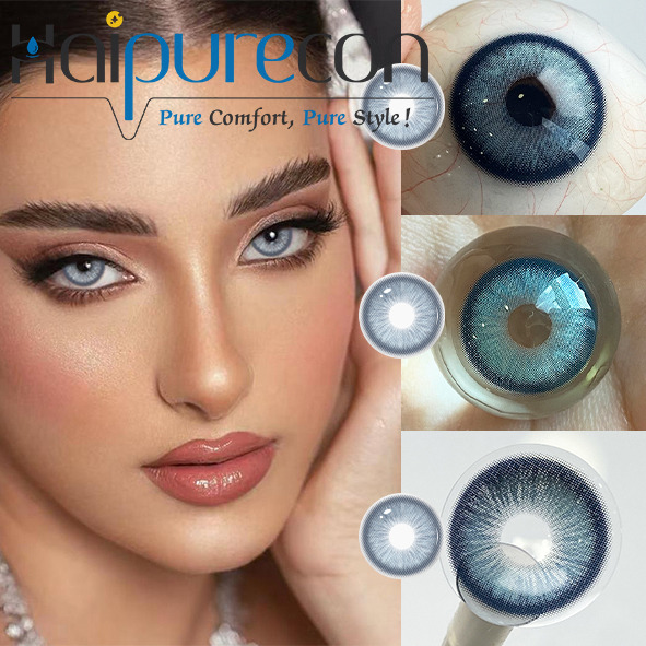
Have you ever bought cosmetic contacts hoping for a stunning, subtle transformation, only to look in the mirror and see a pixelated, artificial stare? This frustrating buyer’s dilemma occurs frequently. Many consumers purchase standard lenses, only to discover they look remarkably flat, bug-eyed, or overtly fake under natural daylight conditions. Solving this common issue requires understanding underlying technical design elements. The profound difference between cheap, mass-market alternatives and premium cosmetic options comes down to sophisticated printing methods, nuanced color gradients, and advanced edge blending techniques. Grasping these concepts prevents wasted money and safeguards your overall eye health. This article equips you with an objective, evidence-based framework. You will learn exactly how to evaluate intricate lens designs and confidently choose styles seamlessly integrating into your natural eye color for a flawless, undetectable finish.
Key Takeaways
Realistic lenses rely on multi-tone gradients rather than flat, single-color blocks to mimic the natural depth of a human iris.
The transition at the pupil hole (feathered vs. sharp) dictates whether the lens blends naturally with your native eye color.
Because all colored contact lenses use halftone dot printing, the density and spacing of these dots determine how natural the lens looks at a conversational distance.
High-quality soft colored contact lenses combine realistic aesthetic designs with high oxygen permeability and regulatory compliance (FDA/CE).
Why Most Colored Contact Lenses Look Fake (The "Lizard Eye" Effect)
Consumers often experience significant buyer's remorse regarding cosmetic eye enhancements. Visual failures immediately ruin the illusion of native, natural eyes. The most notorious issue across the market is the sharp pupil transition. A hard, unblended inner ring creates a harsh boundary. It stands in stark contrast against your natural dark pupil. This specific design flaw leads to a synthetic, reptilian look. People commonly refer to this phenomenon as the "lizard eye" effect. When the transition line lacks softness, the human brain instantly registers the eye as artificial.
Next, we must consider opaque monotone prints. Single-color printing completely blocks out the eye's natural radial patterns. Human irises naturally contain intricate lines, flecks, and diverse color variations. When one flat layer of color covers these biological details, the eye takes on a flat, lifeless appearance. One-tone designs fail because they do not replicate dimensional depth. You want enhancements adding richness rather than erasing natural biology.
Furthermore, misaligned base curves severely compromise realism. A poorly fitted lens shifts constantly during blinking. This physical sliding immediately breaks the optical illusion. When you look to the side, a loose lens often lags behind your actual eye movement. This exposes your natural iris underneath the graphic. We recommend always consulting an optometrist to find your precise base curve. Wearing correctly sized Colored Contact Lenses ensures the pattern stays perfectly centered over your pupil throughout the day.
The Manufacturing Reality: Halftone Printing and Iris Depth
Halftone printing drives the entire cosmetic lens industry. You might wonder how manufacturers create complex patterns on such tiny surfaces. They utilize microscopic dots of pigment. Industry experts frequently discuss print resolution limitations on curved hydrogel surfaces. Because the canvas is small, wet, and spherical, traditional high-resolution continuous printing remains physically impossible. Therefore, manufacturers rely heavily on staggered dot placement.
These carefully spaced dots create a brilliant optical illusion. At a normal conversational distance, the human brain seamlessly blends these colored dots into a solid, dimensional hue. Premium brands manipulate dot density to mimic natural iris striations. They leave intentional microscopic gaps between the pigment clusters. These gaps serve a vital physiological function. They allow essential oxygen to pass through the lens material and reach your cornea.
You must manage your expectations properly before making a purchase. All printed lenses look dotted under a macro lens or severe magnification. People often complain online about visible pixels when holding lenses up to bathroom lights. However, true realism depends entirely on how well those dots blend under natural daylight. We judge cosmetic quality by visual integration at an arm's length. Realistic manufacturing respects the boundary between aesthetic coverage and necessary breathable space.
Opacity and Color Blending: The Secret to Natural Colored Contact Lenses
Opacity levels solve distinct aesthetic challenges for different users. Buyers must choose the right transparency category. Enhancement tints work beautifully for light eyes. They utilize sheer printing techniques. This translucent layer amplifies your natural color rather than masking it. If you have pale blue eyes, an enhancement tint can deepen them into a vibrant sapphire without hiding your natural iris patterns.
Conversely, opaque tints are strictly necessary for dark brown eyes. They utilize dense, highly pigmented dot matrices. This density effectively blocks the dark base color. High-quality designs accomplish this opacity without looking muddy or excessively thick. The pigment clusters sit tightly together, providing maximum coverage while maintaining a breathable structure.
Multi-tone technology revolutionizes the final cosmetic look. We highly recommend exploring two-tone and three-tone designs. A three-tone lens incorporates a secondary inner ring. You usually see this inner ring in hazel, soft gold, or warm brown. This subtle ring bridges the visual gap between the main colored graphic and your dark central pupil. It expertly mimics the natural color gradient found in human biology. Finding the best Natural Colored Contact Lenses requires prioritizing this three-tone blending. Without a transition ring, the primary color clashes harshly against the black pupil, recreating the dreaded synthetic stare.
The Role of the Limbal Ring in Framing the Eye
The limbal ring represents the dark outer circle framing the human iris. Biologically, a prominent limbal ring subconsciously signals youth, vitality, and optimal health. It provides distinct definition and makes the whites of the eyes appear brighter. However, edge execution varies wildly between competing brands. Knowing how to evaluate these borders saves you from unnatural results.
Low-quality products often use thick, solid black outer rings. They look exactly like harsh marker lines drawn directly on the eye. They scream artificiality and belong exclusively in theatrical settings. Premium alternatives use soft, feathered, or semi-translucent dark grey edges. These softer borders mimic the way a natural limbal ring gently fades into the surrounding sclera. Feathered edges create an enlarging effect gently, retaining a sophisticated daytime aesthetic.
Sometimes, you want maximum color alteration without any enlarging effect. In these specific cases, opt for no-limbal-ring designs. These styles offer a hyper-realistic daytime look. They soften the outer border entirely. They blend the pigment straight into the white of the eye. This creates a highly convincing, romantic aesthetic. Many wearers prefer no-limbal-ring options for professional workplace environments where subtle enhancements matter most.
Material and Reflection: Why Soft Colored Contact Lenses Lead the Market
Aesthetics matter very little if the product damages your eyes. Material science dictates both comfort and visual appearance. Light refraction behaves differently depending on the chosen polymers. The high moisture content found in hydrogel and silicone hydrogel mimics our natural tear film. This organic interaction provides a glossy, lifelike reflection. Hard plastics or outdated polymers simply cannot replicate this wet, natural shine. Modern Soft Colored Contact Lenses bend light exactly like a biological eye, making them virtually undetectable.
We must also prioritize strict compliance and safety. Realistic pigments must remain safely sandwiched between clear lens layers. Reputable manufacturers use this sandwich technique extensively. It ensures no dye ever touches your delicate eye tissue. If raw pigment touches the cornea directly, it causes severe staining, friction, and dangerous irritation. You risk permanent damage when buying unregulated products from dubious sources.
You must meticulously verify FDA clearance or CE marking. Treat this regulatory approval as an absolute, non-negotiable purchasing criterion. Certified lenses guarantee thorough clinical testing for biocompatibility. They offer high oxygen permeability, keeping your eyes white and healthy. Red, suffocated eyes instantly ruin even the most beautifully designed cosmetic pattern.
A Shortlisting Framework for Choosing Your Ideal Lens
Navigating thousands of cosmetic options requires a concrete decision matrix. We have broken down the selection process into three actionable steps. Following this framework guarantees a comfortable fit and a hyper-realistic result.
Step 1 requires identifying your base eye color. Dark brown eyes demand three-tone opaque lenses for adequate coverage. Light eyes offer more flexibility. You can successfully use sheer, translucent enhancement tints to shift your native shade gently.
Step 2 involves choosing your desired vibe. Decide between limbal and no-limbal designs. Select a feathered limbal ring if you want a subtle enlarging effect. Choose a no-limbal-ring design for strict color alteration and maximum everyday realism. This choice dramatically alters your final makeup aesthetic.
Step 3 demands verifying sizing and safety. Check the Base Curve (BC) and Diameter (DIA) against an optometrist's official prescription. Accurate measurements ensure the graphic sits correctly over your iris without slipping. Proper sizing prevents the awkward "double-iris" look.
Lens Selection Framework Matrix
Base Eye Color
Desired Outcome
Recommended Opacity
Recommended Limbal Style
Dark Brown / Black
Complete Color Change
High Opacity (3-Tone)
No Limbal Ring or Soft Feathered
Dark Brown / Black
Eye Enlargement (Dolly Look)
High Opacity (2-Tone or 3-Tone)
Defined but Blended Limbal Ring
Light Blue / Green
Subtle Shade Enhancement
Sheer Enhancement Tint
No Limbal Ring
Light Blue / Green
Dramatic Contrast
Medium Opacity (2-Tone)
Dark Contrasting Limbal Ring
Conclusion
A realistic cosmetic pattern never relies on one single factor. It requires a delicate combination of feathered pupil holes, multi-tone halftone printing, and appropriate limbal ring shading. Understanding the relationship between dot density and light refraction empowers you to make smarter purchasing decisions. Flat, single-color prints always yield synthetic results. True dimension comes from layering.
The best cosmetic options always respect the native anatomy of your eye rather than trying to paint over it entirely. They utilize your natural tear film to create realistic reflections. They leverage transition rings to blend synthetic pigments smoothly into your natural biological colors.
We strongly encourage you to consult a licensed optometrist for your exact measurements. Never guess your base curve or diameter. Once you have your prescription, begin shortlisting reputable, CE/FDA-approved brands featuring advanced three-tone color blending. Prioritize safety, embrace scientific design principles, and enjoy your stunning new look.
FAQ
Q: Why do colored contacts look pixelated up close?
A: Halftone dot printing remains essential for breathability and oxygen permeability. Manufacturers cannot use solid sheets of pigment because they would suffocate the cornea. These microscopic gaps allow oxygen transmission. While they look pixelated under close inspection, your brain blends these dots into a solid color at a normal conversational distance.
Q: Can colored contacts look natural on dark brown eyes?
A: Yes, provided you select opaque, three-tone lenses. You must choose a design featuring a hazel, gold, or light brown inner transition ring. This inner gradient smoothly blends the opaque outer pigment with your naturally dark pupil, completely eliminating the harsh, artificial "lizard eye" effect.
Q: What is the most natural contact lens diameter?
A: Graphic diameters falling between 13.0mm and 13.6mm closely match the average human iris. Staying within this specific range effectively avoids the artificial "doll eye" or circle lens effect caused by larger diameters. Always match the graphic diameter to your desired level of subtlety.
Q: Are soft colored contact lenses safe for daily wear?
A: Yes, they are perfectly safe if prescribed by an eye care professional and properly maintained. You must source them from regulated brands utilizing "sandwich" color technology. This advanced manufacturing method completely prevents raw pigment from directly touching your eye, ensuring long-term corneal health.